Style your graphs in Memgraph Lab
In this tutorial, you'll learn how to use Style script to add style to your graphs. You'll use the sandbox site Memgraph Playground that runs Memgraph Lab to try out some styling.
Prerequisites
For this tutorial, there are no particular prerequisites. All you need is a web browser.
Step 1 - Connecting to Memgraph sandbox
First, open the Memgraph Playground sandbox Europe backpacking. When the sandbox is loaded, do the following:
- Expand Sample Query Examples.
- Run the first query to display the shortest path from Spain to Russia.
- Click the gear icon to open the Style editor
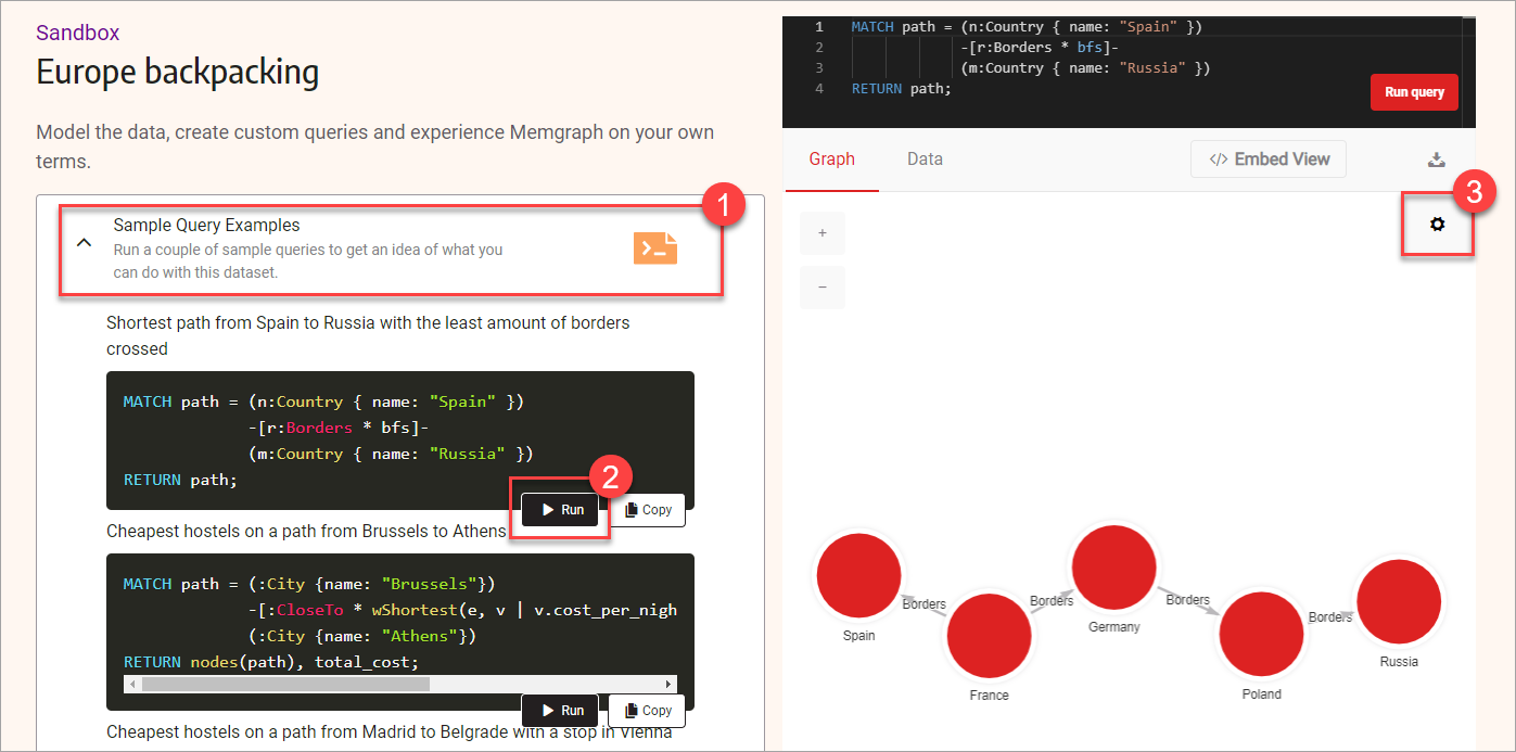
Notice there is code already present in the Style editor. In the next few steps, you'll learn how to adjust that code to style your graph using colors and images.
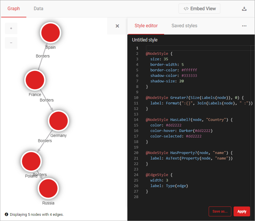
Step 2 - Using colors and borders to style graph nodes
With the Style editor in front of you, you are ready to style your graph by modifying the existing style and adding some new style rules. First, let's modify the code that defines the node style. Look for this section of the code:
@NodeStyle {
  size: 50
  border-width: 5
  border-color: #ffffff
  shadow-color: #bab8bb
  shadow-size: 6
}
This part of the code is called a directive, and it is used to define how the node looks and feels.
To start, make the node smaller but with a larger and darker shadow. Update the
values for properties size, shadow-color, and shadow-size. Set the value
of size to 35, shadow-color to #333333, and shadow-size to 20. Your
code should now look like this:
@NodeStyle {
  size: 35
  border-width: 5
  border-color: #ffffff
  shadow-color: #333333
  shadow-size: 20
}
Click Apply to see what your graph looks like now.
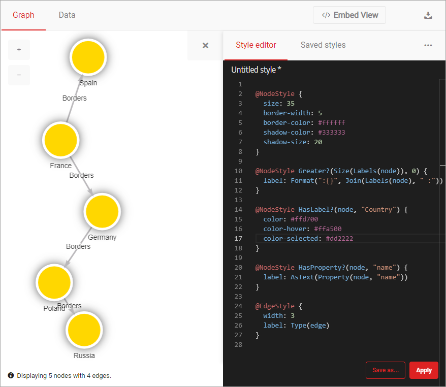
Now change the color of the nodes from red to gold and make them orange on hover. Find the following code:
@NodeStyle HasLabel?(node, "Country") {
  color: #dd2222
  color-hover: Darker(#dd2222)
  color-selected: #dd2222
}
Update value of the property color to #ffd700 and color-hover to
#ffa500. The updated code should look like this:
@NodeStyle HasLabel?(node, "Country") {
  color: #ffd700
  color-hover: #ffa500
  color-selected: #dd2222
}
Don't forget to click Apply to see your updated graph.
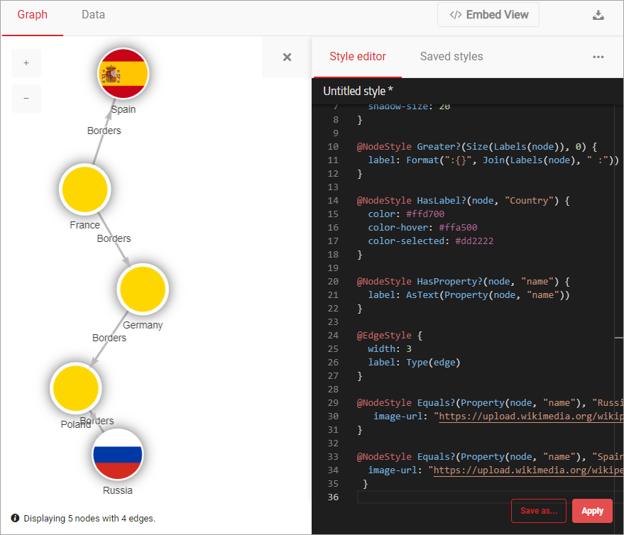
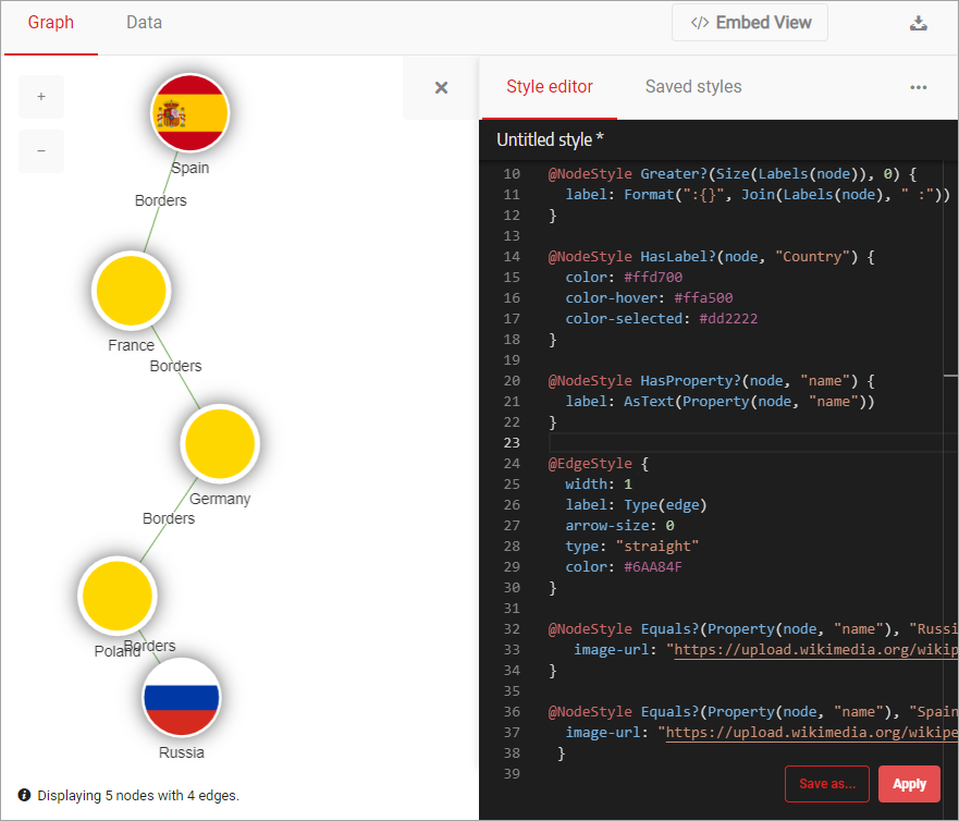
Step 3 - Add images to the nodes
Now that all the colors and borders are just right, it's time to add images to the nodes. Let's add them to the first and last node using two different images from Wikipedia. You'll use a predicate to assign a value to a node with a specific node value.
To display the two images, add the following code at the end of the style script:
@NodeStyle Equals?(Property(node, "name"), "Russia") {
   image-url: "https://upload.wikimedia.org/wikipedia/en/thumb/f/f3/Flag_of_Russia.svg/320px-Flag_of_Russia.svg.png"
}

@NodeStyle Equals?(Property(node, "name"), "Spain") {
  image-url: "https://upload.wikimedia.org/wikipedia/en/thumb/9/9a/Flag_of_Spain.svg/320px-Flag_of_Spain.svg.png"
 }
Click Apply to update the style of your graph. Your graph is looking better with each step, isn't it?
Step 4 - Using colors to style graph relationships
With all of the nodes looking just like you wanted them to, it's time to style
the relationships between them. You'll represent your relationships as straight,
thin lines with no arrows. To do that, locate the @EdgeStyle directive and the
following code:
@EdgeStyle {
  width: 3
  label: Type(edge)
}
Now replace that code with this one:
@EdgeStyle {
  width: 1
  label: Type(edge)
  arrow-size: 0
  color: #6AA84F
}
Click Apply and your relationships will have a new style!
Step 5 - Checking the final result
We are at the end of this tutorial. Move the nodes around to get the final look. Your result could look similar to the image below.
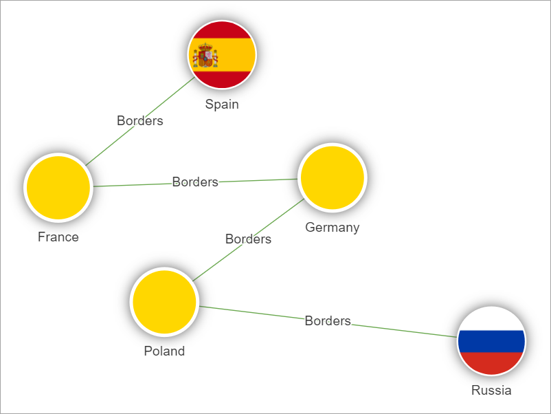
The complete styling code for this graph is:
@NodeStyle {
  size: 35
  border-width: 5
  border-color: #ffffff
  shadow-color: #333333
  shadow-size: 20
}

@NodeStyle Greater?(Size(Labels(node)), 0) {
  label: Format(":{}", Join(Labels(node), " :"))
}

@NodeStyle HasLabel?(node, "Country") {
  color: #ffd700
  color-hover: #ffa500
  color-selected: #dd2222
}

@NodeStyle HasProperty?(node, "name") {
  label: AsText(Property(node, "name"))
}

@EdgeStyle {
  width: 1
  label: Type(edge)
  arrow-size: 0
  color: #6AA84F
}

@NodeStyle Equals?(Property(node, "name"), "Russia") {
   image-url: "https://upload.wikimedia.org/wikipedia/en/thumb/f/f3/Flag_of_Russia.svg/320px-Flag_of_Russia.svg.png"
}

@NodeStyle Equals?(Property(node, "name"), "Spain") {
  image-url: "https://upload.wikimedia.org/wikipedia/en/thumb/9/9a/Flag_of_Spain.svg/320px-Flag_of_Spain.svg.png"
 }
Where to next?
In this tutorial, you've learned how to style graphs, nodes and relationships in particular, using Memgraph Lab. We hope that you had fun going through this tutorial. You can continue playing in Playground, or even better download and install Memgraph Platform on your computer.
To get a taste of some more advanced styling features, head to our blog post How to style your graphs in Memgraph Lab. Also, be sure to check out Quick start guide to Style script or take a deep dive into the Style script reference guide to learn more about the language.